As a WordPress user, it is not really difficult for you to start a blog or website because the content management system has eased the entire process that goes into the creation of a blog/site. Responsive design is obviously a popular topic in the web design industry right now, and WordPress continues to grow as one of the most popular content management systems.
In this post we are sharing some of the creative responsive blog WordPress themes. These responsive blog WordPress themes are best for your personal blogging WordPress website. Sharing photos, personal fun videos or just copy pasting articles to earn money as most newbies do can be done here. With WordPress powering the theme everything goes dynamic and easy to update with new trends.
Check our responsive blog WordPress themes if you are into serious blogging after settling with personal blog and learning the fundamentals of whole whole web works. You will find blog themes with tumblr style, flat design, parallax design and more you will be interested in. We also love this comprehensive list of free responsive WordPress themes.
Magtastico Responsive Masonry Blog WordPress Theme
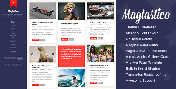
Magtastico is a responsive masonry blog WordPress theme. With its clean and modern layout, unlimited color options and great design you’re sure to fall head over heels for this theme. This theme is perfect for a blog, magazine, photography, portfolio or other content/image driven website. With the included post formats for galleries, quotes, audio files and videos it’s easy to share your thoughts or your work with the world.
Fabulous – Responsive Masonry Blog WordPress Theme
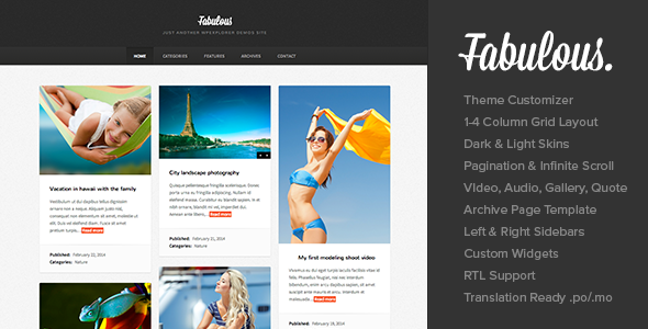
Fabulous is a modern masonry photography blog theme with a classic style that is never out of fashion. Perfect for bloggers, photographer, designers, developers and more this theme puts the spotlight on your content (where it should be). Use it as a blog or a portfolio! Your creativity shouldn’t be limited by your WordPress theme – but it also shouldn’t take you a month to get your website up and going. We kept the user in mind as we coded Fabulous to the peak of perfection. There are plenty of options to love – including custom logo upload, unlimited color options, pagination or infinite scroll options, post entry options and much more.
Senna – Responsive Portfolio/ Blog WordPress Theme

Senna is the WP theme all creatives have been waiting for. Are you a creative agency, graphic designer, fashion creator, photographer, artist or anything in between? Then this theme is just perfect to show off your work. Boasting a clean, minimalistic design with a bold and carefully thought typography, Senna let’s your works shine and play in the eyes of your visitors. This is a very visual theme, merging pictures and text seamlessly, featuring a grid based, patchwork portfolio section and page that entices your visitors to explore and have a full experience of your creations.
Inzin – Responsive Blog WordPress Themes
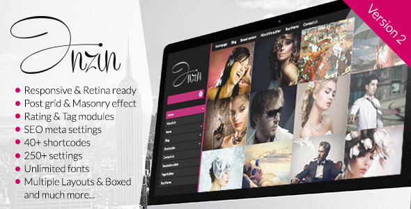
Inzin is a clean, responsive, left-sided wordpress theme that can be used as portfolio, magazine, or blog. The theme comes with huge options panel, more than 40 shortcodes that can be generated with the Visual composer with user-friendly option bar. Theme contains all of the post styles (Standard, Gallery, Link, Image, Quote, Status, Video and Self hosted Video, Audio and Self-hostied Audio), 4 page styles, 7 widgets.
Milli Responsive Blog WordPress Themes

Milli is a super cool WordPress Theme designed with personal blogs in mind, but can also do as another kind of blog site or even as a simple portfolio to show off your work! It is responsive and designed to look beautiful whether you are using a desktop computer or a mobile phone. Features: Responsive HTML5/CSS3 Design, Easy to use, Light & Dark Styles, included Full-width layout, Multiple Slider effects Post Formats: Standard, Image, Video, Audio, Quote and Link, Options to change theme colors, Dropdown menus, Fully scalable Featured image, video, audio, Notification bar and more.
Henix: Responsive Portfolio & Blog WordPress Theme
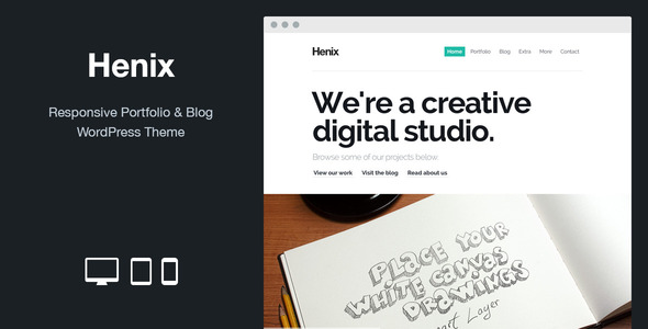
Henix is a responsive portfolio and blog WordPress theme designed for agency. Henix is built on a solid and flexible theme framework and it’s the ideal solution for agencies, studios, designers and everyone who wants to show their work with a fresh and attractive design. Features: Responsive layout, Post Formats (Standard, Aside, Gallery + Lightbox, Image, Link, Quote, Video, Audio), Self hosted Audio and Video, 15 Page Templates, Custom Background for blog and pages, Unlimited Portfolio Pages, Filterable Portfolio, Custom Post Labels, Built-in Related Posts and more.
Fuse – Responsive Portfolio & Blog WordPress Theme
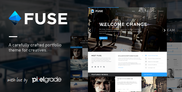
FUSE is a powerful, yet simple, ultra-responsive WordPress theme built for a professional photographer, blogger, creative small agency or graphic designer. Each design element has been carefully considered and crafted with love by the amazing team of PixelGrade, to make your work look spectacular on any device. FUSE takes advantage of the full width of the screen by using bold and contrasted elements that perfectly fit into a precisely crafted responsive three column grid.
Blogster – Responsive Blog WordPress Themes

The main advantage of this theme is fully customizable theme colors, with help theme options panel! Also, the content of the main page is a custom, and is formed using theme shortcodes. You can display an unlimited number of categories, and change the color of the categories, etc. You can also display video, audio and slider in posts! In the theme a lot of settings, with which you can easily customize the theme, as you need, also detailed documentation and quick support!
OldCar – Responsive Blog & Grid WordPress Theme
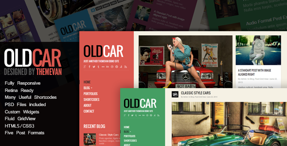
OldCar theme, it’s a creative HTML5 WordPress Theme that is suitable for personal blog or show the portfolios. There are two layout for blog, normal layout and fluid grid view. You can easy to change the main color style with custom options, and it also provides 5 styling for the wordpress custom post formats like tumblr style. The most important is there are many useful shortcodes ready, so the home page not only can show the recent posts, but also you can make a different home page with shortcodes that include a slider, service, team, etc.
FitnessMag – Responsive Blogging WordPress Theme
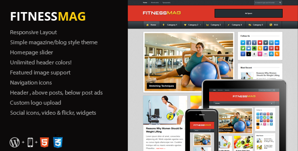
FitnessMag is a premium WordPress theme (WP 3.6+ ready) created with minimal blogs and magazine sites in mind. The theme features a fully responsive design that will look great across various screen sizes and a design that is both modern and simple. Perfect for all sorts of blogs – such as fitness blogs – the theme is content-oriented, developed with SEO in mind and overall a great way to share your thoughts and media online.
Bloggap – Responsive Blog WordPress Theme
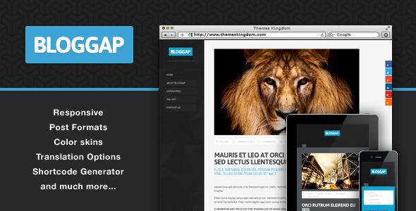
Looking to give your visitors a fun new way to browse your latest posts, display loads of content in a beautifully simple and cool way then Bloggap is great choice for you. The theme is responsive, meaning it will look and work great on all screen resolutions and mobile devices as well. With more devices come varying screen resolutions, definitions and orientations. This theme is optimized for iPad and iPhone and for all screen resolutions. Photoshop files are included in the theme package if you need to do any customization on theme design.
Photik – Responsive Portfolio & Blog WordPress Theme
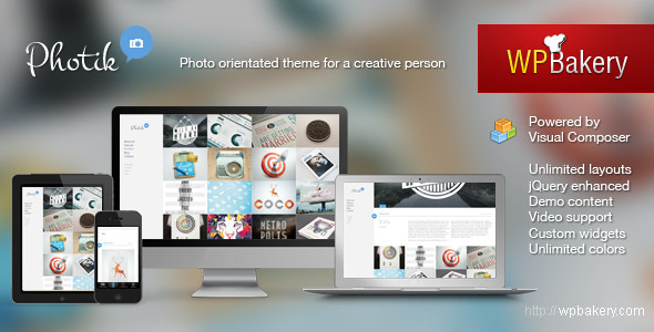
Photik is uber cool theme made specially for creative folks with outstanding portfolios. If you are looking for a theme to showcase your work – look no further! As a free Bonus you’ll get the award winning Visual Composer plugin integrated into the theme, which lets you to create complex layouts with simple drag-n-drop interface. Features: Translation ready with po/mo files, Responsive & mobile ready layout, Post Format Support: Standard, Image, Video, Gallery, Link, Aside, Quote, Stream video from any popular services (Youtube/Vimeo/…), Control fonts setting right from Theme options page, Google fonts out of the box and more.
Lucent – Responsive Portfolio/Blog WordPress Theme
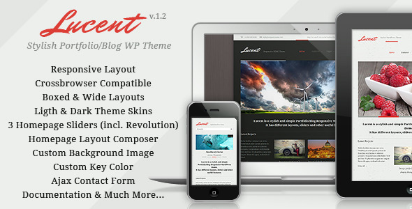
Lucent is a stylish and at the same time simple Portfolio/Blog Responsive WordPress theme. It will be perfectly good for any personal page, portfolio, blog because the product has been created by using the latest WP version in combination with an attractive responsive design. Thus it is easily usable on any device from a Desktop PC to a mobile phone. Features: Stylish and clean design, Responsive layout, Cross browser compatible (incl. IE8), Boxed and wide layouts, Light and dark versions, Advanced theme options panel, 3 diffrernt Homepage sliders:, Revolution (save $16), Flex, Elastic, Homepage layout composer, XML and json dummy import data, Custom key color and more.
GoBlog – Responsive WordPress Blog Theme
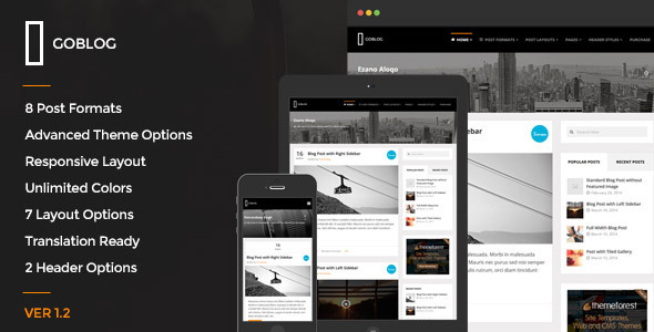
GoBlog is a blog style responsive WordPress theme. It supports 8 post formats (Standard, Gallery, Link, Quote, Video, Image, Status and Audio). For video and audio post formats, it is really easy to embed video and audio files to posts. This theme has beautiful slider just below header for intro text or anything like that. For standard articles, the main focus is on content.
HEAP – A Snappy Responsive WordPress Blog Theme

HEAP is a Personal Blogging Theme for WordPress and an effortlessly tool for publishers of all kind, cherished for its flexibility, clean layouts and speed. Whether you’re looking to share your own thoughts, write about your latest findings or just have a scrapbook of photos, videos, quotes or other stuff, HEAP is designed to fulfill these and a lot more. You can rest assured that every pixel will respond as it should no matter if your visitors are on a desktop, tablet or down to the phone in your pocket.