In the world of design, achieving a clean, modern aesthetic is more than just a trend—it’s a timeless approach that emphasizes clarity, simplicity, and balance. Effortless elegance is about creating visual harmony without overwhelming the viewer, resulting in a refined, polished look. By focusing on essential design elements and removing unnecessary clutter, you can achieve a sophisticated style that stands out for its subtlety and purpose. This guide explores the foundational principles for mastering clean, modern design with an air of effortless elegance.
1. Adopt Minimalism

Crafting a clean, modern design that radiates effortless elegance requires a delicate balance of simplicity, functionality, and visual appeal. By incorporating intentional design principles, you can create a look that is not only visually striking but also efficient and user-friendly. Below are essential rules to help you achieve this modern design style with finesse.
2. Key Components of Minimalist Elegance
Minimalist elegance is defined by restraint, refinement, and attention to detail. The key components include:
- Simplicity: Avoid excessive ornamentation and focus on clean lines and uncluttered layouts.
- Balance: Ensure that your design elements are distributed evenly to create a sense of harmony.
- Functionality: A clean design should never sacrifice usability. Every element must have a purpose, contributing to both form and function.
- Hierarchy: Use size, color, and placement to prioritize the most important
- elements.
- Consistency: Maintain a consistent style throughout your design to create a cohesive look.
For a design to be both minimal and elegant, it should possess certain key elements: balance, symmetry, and alignment. These aspects ensure that the design remains functional while retaining its visual appeal. Careful placement of elements creates harmony and leads to an intuitive user experience. Aim to keep the layout balanced, with each element complementing the others without overwhelming the viewer.
3. The Beauty of Simplicity
Simplicity is the ultimate sophistication. Modern design seeks to communicate effectively and efficiently, without unnecessary embellishments. A simple design is not devoid of personality, but it should strip away excess while still being visually captivating. Simplicity allows users to focus on what matters most, improving the overall user experience and the aesthetic harmony of the design.
4. Use High-Quality Imagery

Visuals play a significant role in creating a clean and modern aesthetic. Using high-quality imagery is essential because images often communicate more than words. Choose visuals that resonate with the theme and mood of your design, and ensure they are crisp and clear. Low-resolution or irrelevant images can disrupt the elegance of your layout and detract from the overall experience.
5. Using Negative Space to Enhance Modern Design
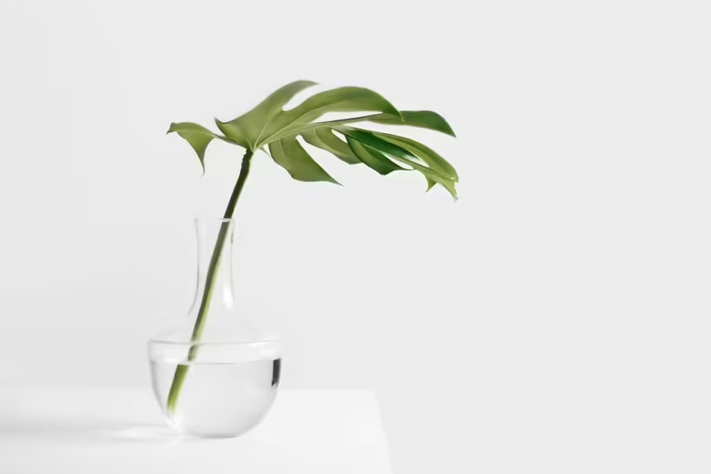
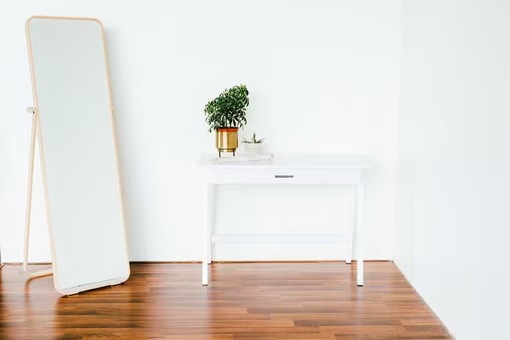
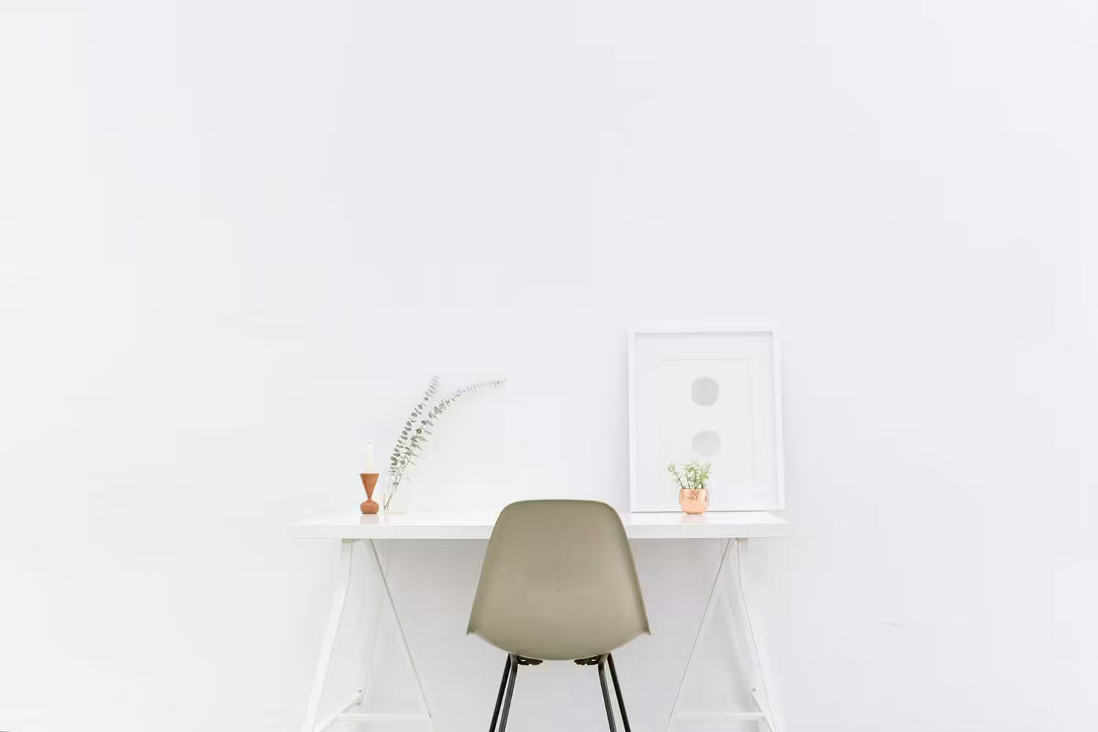
Negative space, or whitespace, is one of the most powerful tools in modern design. It helps balance the elements on the page and directs the viewer’s focus toward important content. Benefits of negative space:
- Improved Readability: Allowing text and images to “breathe” makes the design more accessible and enjoyable to engage with.
- A Clean, Modern Aesthetic: Negative space is a hallmark of minimalist design, contributing to a sleek and modern look. It offers an uncluttered, organized feel that is visually appealing and easy to navigate.
- Creates a Focal Point: By surrounding key elements with space, you naturally draw attention to them, emphasizing their importance.
- Increased User Engagement: With ample negative space, users are less likely to feel overwhelmed by a dense interface. This leads to a more pleasant and engaging user experience, encouraging interaction with the design.
- Timeless and Versatile Design: Designs that make good use of negative space tend to be timeless and adaptable across different mediums, from web design to print. It adds a sense of balance and harmony to the overall composition.
6. Focus on Typography
Typography is a cornerstone of modern design and contributes heavily to its elegance. Choosing the right typeface, along with appropriate font sizes and spacing, can make or break a design. Clean, sans-serif fonts are often the go-to choice for modern designs because they exude simplicity and professionalism. Additionally, paying attention to line height, letter spacing, and text alignment will ensure readability and contribute to the overall sense of harmony.
7. Incorporating Functional Design

Elegance is not just about aesthetics—functionality is equally important in a modern design. The design should serve a clear purpose, making it easy for users to interact with. A visually appealing design that’s hard to navigate or lacks usability will fail to engage users. Thus, functionality should be a driving force behind your design decisions.
8. Critical Elements of Minimal Elegance
For a design to be both minimal and elegant, it should possess certain key elements: balance, symmetry, and alignment. These aspects ensure that the design remains functional while retaining its visual appeal. Careful placement of elements creates harmony and leads to an intuitive user experience. Aim to keep the layout balanced, with each element complementing the others without overwhelming the viewer.
9. Balancing Elements for Smooth Minimalist Design
Achieving balance is essential for crafting seamless, minimalist designs. Every element—whether it’s text, images, lines, or shapes—needs to complement one another, working together to create a cohesive and visually appealing layout. Here are some key principles to help maintain balance:
- Equal Distribution: Distribute design elements evenly across the layout, ensuring no one section feels too heavy or cluttered.
- Color Harmony: Balance contrasting colors with neutrals, and use color sparingly to highlight essential design elements without overwhelming the viewer.
- Use Symmetry or Asymmetry: While symmetry offers a sense of stability, asymmetry can create dynamic and visually interesting compositions when used intentionally.
- Spacing: Consistent spacing between elements fosters a sense of order and balance, preventing the layout from feeling cluttered.
- Visual Weight: Ensure that elements with larger sizes, bold colors, or heavier fonts are balanced by lighter elements elsewhere to maintain equilibrium.
Conclusion
In conclusion, embracing the principles of effortless elegance in clean, modern design transcends mere aesthetics; it fosters an experience that resonates with users while conveying clarity and sophistication. By prioritizing minimalism, high-quality imagery, effective whitespace usage, and functional design, you can achieve a harmonious balance that enhances usability. Choosing a neutral palette and focusing on typography ensures that every element serves a purpose. These design principles empower you to create visually striking and functional work, enabling you to stand out in a dynamic digital landscape. Remember, the true beauty of simplicity lies in its ability to communicate effectively and leave a lasting impression on your audience.
